Who: Career Foundry (course project)
What: Draft, Research, Personas, User Journeys, Information Architecture, Wireframing, Prototyping, Testing, UI Design
Result: App draft, ready to be developed

A new way to support learning of a special target group
Project Summary
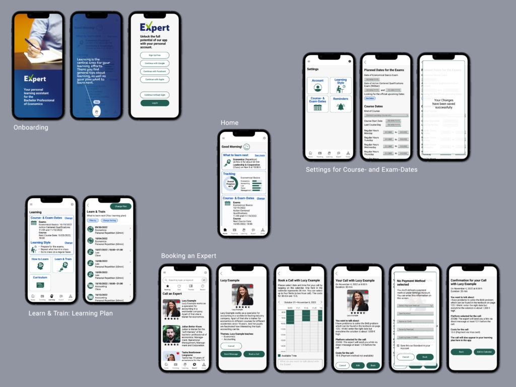
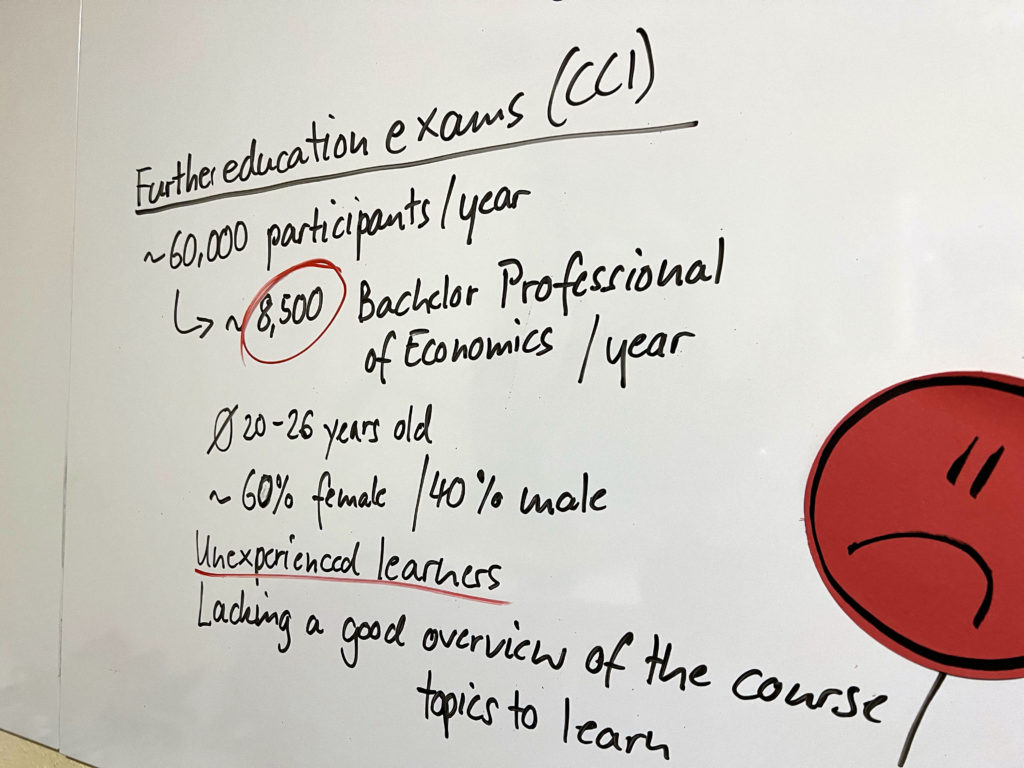
I developed the draft and the user experience of a new learning app. The app helps its users, participants of courses for the Bachelor Professional of Economics (CCI), to plan and track their learning efforts. It can be used by participants of all kinds of courses and all academies, because it is an add on, and this offers the possibility to reach a big target group (about 8600 participants each year).
Problem Statement
Participants of courses which prepare for the exam for the Bachelor Professional of Economics (CCI) need a way to plan and track their learning efforts for the course because often they have no experience in learning. We will know this to be true when we see that they actively use the learning plan the app offers.
Making planning and tracking of learning efforts easy for unexperienced learners
The learning content and curriculum of courses for the Bachelor Professional of Economics is defined by law and extremely structured. While the course style of different academies can vary completely, the topics the participants have to learn is always the same.
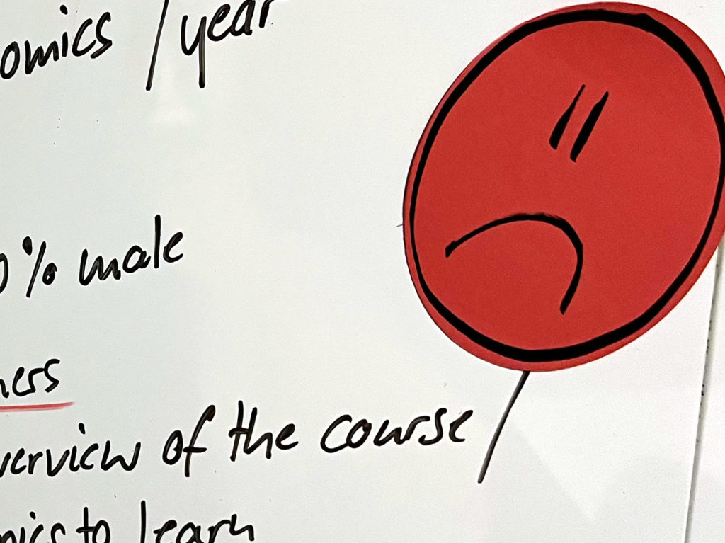
The majority of them have finished an apprenticeship for a commercial job and want to improve their career chances by getting an official certificate of a further education exam. Most of them are between 20 and 26 years old and have low to no experience in learning for such a course. They usually use their smartphones for nearly every activity they undertake. My research showed that they would use a smartphone app which gives them a better overview about the topics relevant for the exam und helps them to organize their learning sessions.
My role in the project
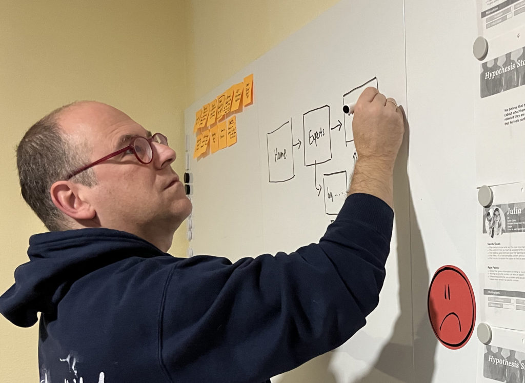
Because this was a course project, I was responsible for all steps. I planned the research, interviewed real course participants, analyzed the results, developed personas as well as user flows and user journeys. I set up the information architecture, made wireframes at all levels of detail and transformed them – after I carried out usability testing with low-fidelity prototypes – in a functional high-fidelity prototype. I developed the UI Design in an iterative process and fixed the design in a style guide.
Although it was a course project which I had to carry out by myself, I interacted with fellow students to get feedback for a better product. I also had contact to representatives of the Chamber of Commerce and Industry (CCI) to discuss their experiences of such courses and the need for the support of course participants. I talked with an app developer to see if all of the planned features can be realized and how.
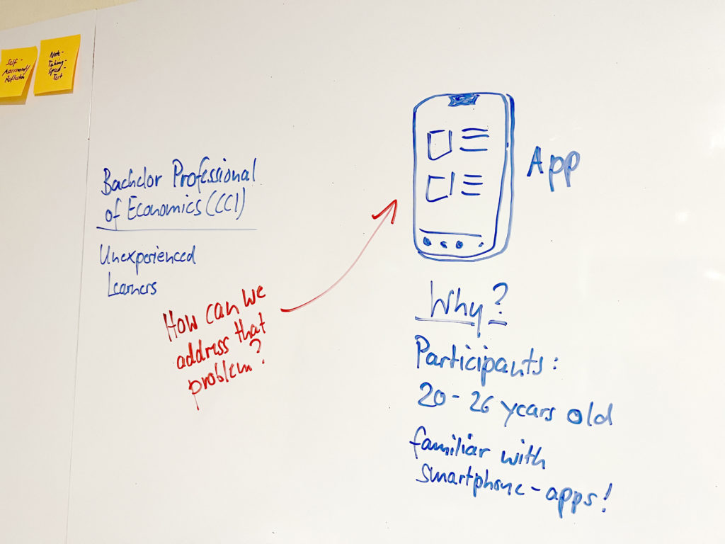
The mandate: A new app from scratch
The mandate for the project was to develop the UX Design for a complete new app applying all the different skills a UX Designer should bring to the job. The project was structured in six phases.
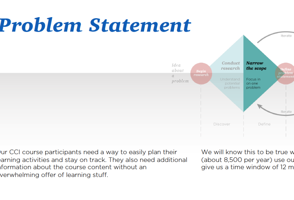
Phase 1: Analysis
In this phase I tried to get a good understanding of the problem. I searched a lot on internet and talked with employees of the CCI and former participants. I formulated the problem statement and refined it in several steps. And I tried to get a sense for the market and potentially competitors. That showed me that there are tons of learning apps out there and there are apps for course participants of the given Bachelor Professional. But none of the apps guides the users through their learning process.
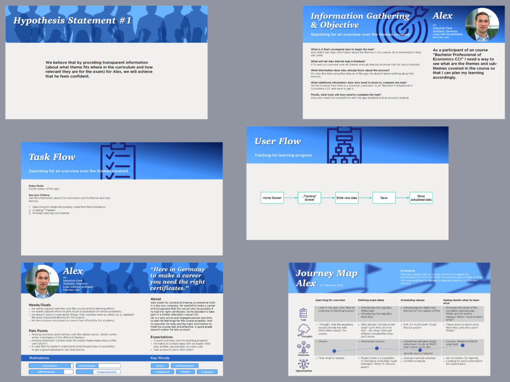
Phase 2: Understanding the User
In the second phase I wanted to understand my potential users. It is a very defined group of people and it was important for me to talk with real representatives of this group. In the “fachwirt-forum.de” I posted that I’m searching and I got several answers from all around Germany. Finally I interviewed six persons via Zoom, guided by a interview script, which I had developed.
I condensed the results by using empathy mapping. After that I created user personas, user journeys, user flows and task flows.
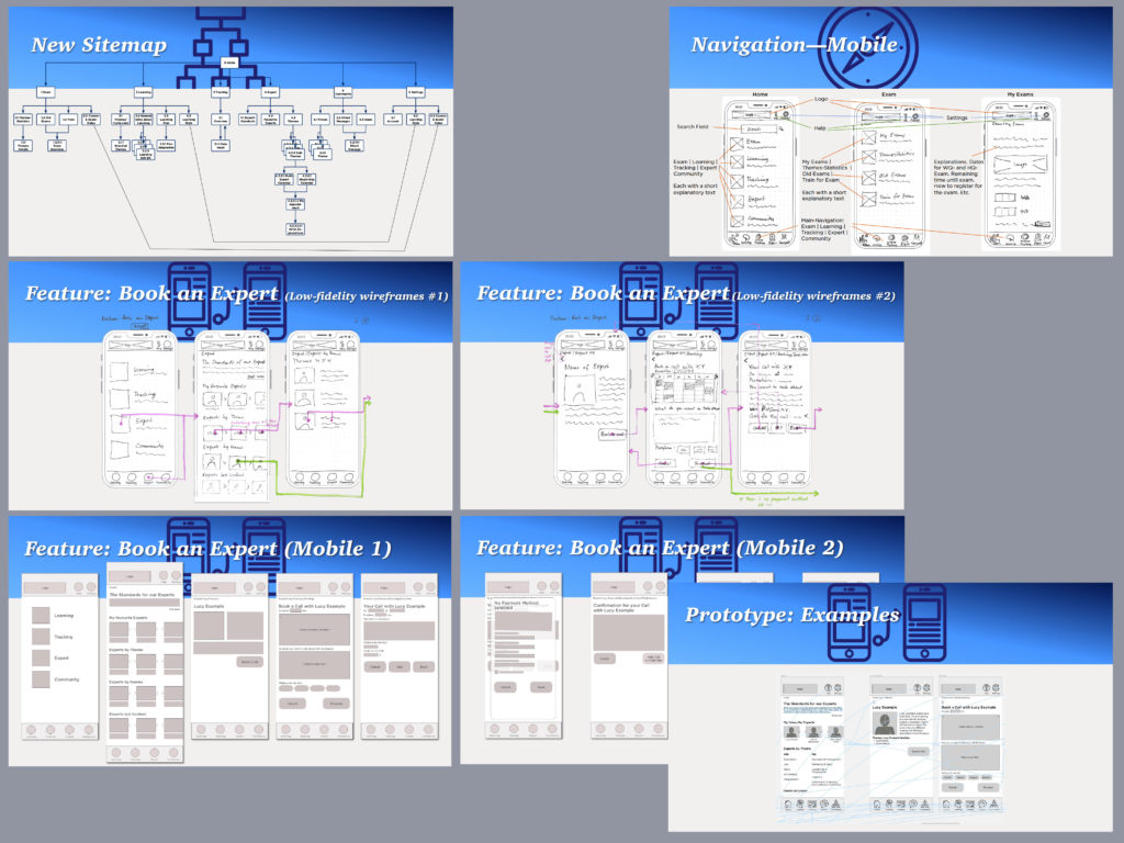
Phase 3: Foundational Design
Phase three was where I worked on the information architecture and developed a first version of the sitemap, which I refined after a card sorting session. Then in short bursts I sketched first rough, low fidelity wireframes with pen and paper, then went to Figma to transform them in a clickable, still low-fidelity prototype and step by step in versions of higher fidelity.
Phase 4: Usability Testing
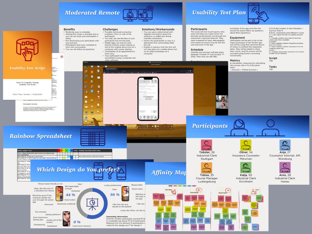
I started phase four by planning usability testing, searching test participants and writing a test script, to guarantee a neutral, standardized test setting. I had six usability testing sessions with participants with different age and different technical background. I identified certain problems and prioritized them, addressing the most important issues first, like a missing search function.
At the end of this face stood a preference testing for different design solutions.
Phase 5: Refining the Design
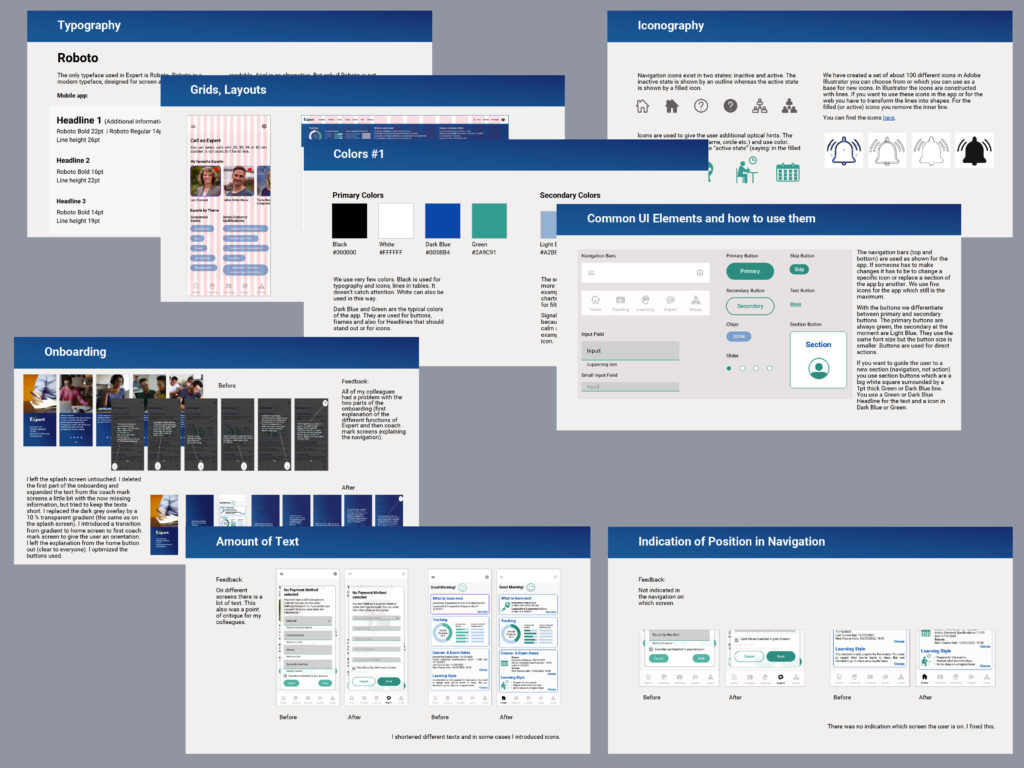
Here all was about visual design and UI Design. In various iterations I refined the design, working on the functional Figma-prototype. To identify critical points I worked together with other students.
As a visible result I documented colors, typography, certain UI elements and grids in a style guide and also prepared all deliverables to hand it off to a possible developer.
Phase 6: End-to-End Design
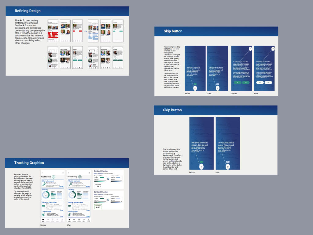
In this last phase I made last changes on the UI Design, looking at accessibility issues like contrast and font sizes and gave it a last polish. This lasted to a version which I will discuss with an app developer to realize it, because I got a lot of positive feedback from my interviewees, test participants and contacts from the further education world. They think, it would be worth to bring the app to reality.
