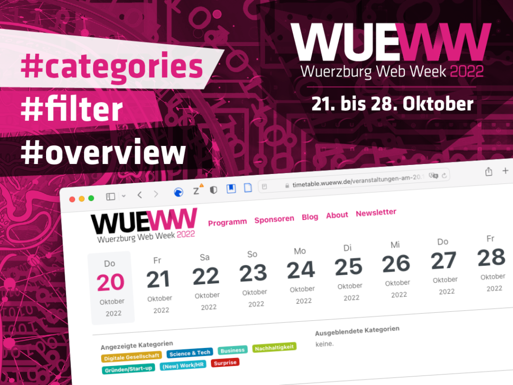
Who: Wuerzburg WebWeek
What: Research, Prototyping, Testing
Result: Increased user satisfaction


Improving the Overview of 200 Events
Project Summary
The Wuerzburg WebWeek (WueWW) offers a frame where small events from tech-companies and individuals can take place; eight days of meetups, presentations and discussions at more than 100 locations in and around Würzburg. After the idea was born to give the 200 events a structure by applying categories to them, I developed the mechanism to select certain events on the website.
Problem Statement
Visitors of the WueWW-events wanted to have a fast and easy way to find the events they were interested in on the timetable of the website, although there were up to 46 different events on one single day.
A better Overview for different Kind of Users
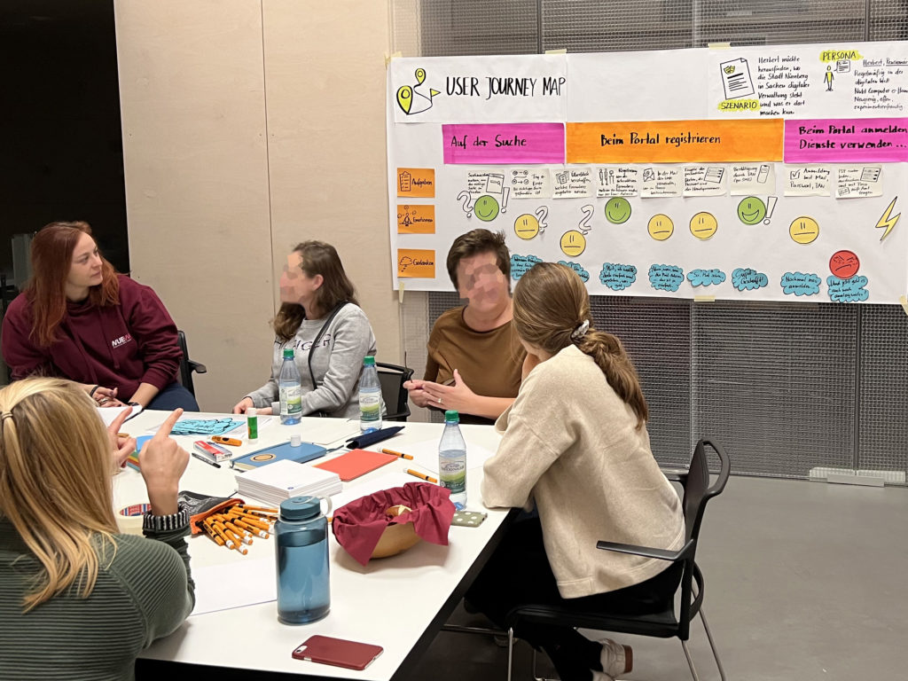
The visitors of the WueWW have different backgrounds. Many of them are tech geeks, but there are also “normal” people with low to medium experience in interacting with apps or websites, and because of one organizer (an association with the goal to teach older people the usage of computer and internet) there are some older users.
My Role in the Project
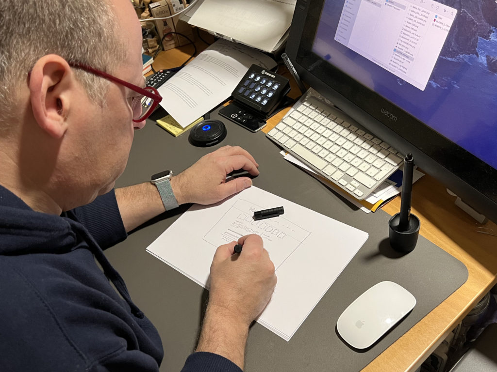
As a member of the WebWeek organization team I created with others the idea to introduce categories for the events to give more structure. As UX Designer I developed the mechanism how these categories serve on the website as selector for the events. But I only collaborated with the head of the organization team and had no direct contact with the web developers.
A new Feature in one Week
The organization of the 5th Wuerzburg WebWeek had a very tough timeline in general. This influenced every single sub-project and for introducing the new feature for the website we had one week. Given that I had no chance for a long research and/or test phase.
Research
It was important to me to have at least a basic understanding of what the users, the visitors of the WebWeek wanted and needed for the timetable on the website. That’s why I talked to five persons from my circle of acquaintances. I knew that they visited former WebWeeks and used the timetable on the website. The interviews were very informal, only with a rough sketch of an interview guide.
Wireframes and Tests
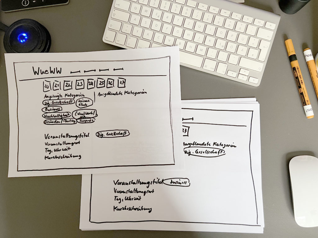
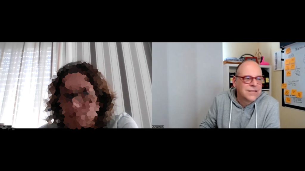
After the short research I created low fidelity wireframes with pen and paper and tested three different ways of a possible solution with five test participants online via Zoom.
After the test it was clear that clickable filter buttons work better than a dropdown menu. With filter buttons the users could select more than only one category interested in.
Prototype
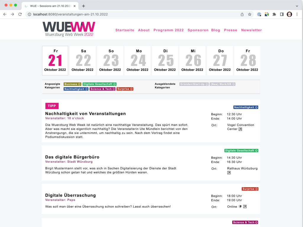
I created two versions of how to select/deselect the filters and turned them into mid- to high-fidelity prototypes in Figma and tested again with three users. It was important to show the selected and the deselected filter buttons and name them clearly. Giving the different categories different colors helped for orientation while different positions for the category was more confusing then helpful.
I made some small corrections in the design and transferred screenshots of the result to the head of the organization team who handed it to the web developer.
A few days later the website went online with the new feature.
Conclusion
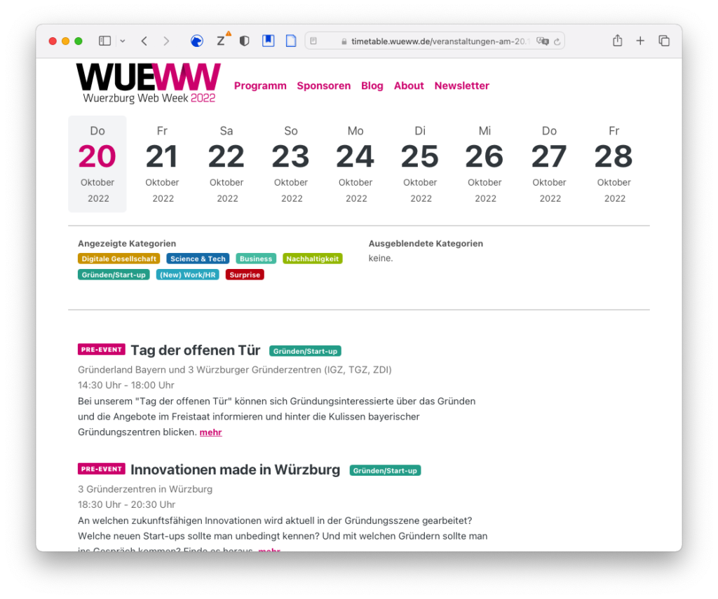
The feedback from the visitors was good. Many of them returned feedback that it is easier to find interesting events than before. We didn’t get negative feedback. That means that I solved the given problem.
I liked this project although it was challenging. It had a very dense time frame which didn’t allow to interact much with real users. And the new feature only solved one part of a major problem. I hope I get the chance to design the user experience of the whole event calendar (in combination with the existing web app) next year.
Original Voices
„The new tagging feature of the WueWW website helped me getting a better overview of the events, because I could fade out certain topics or I could search for specific topics. Thank you. “
Dipl.-Phys. Thomas Swonke (CEO Webfactor Media GmbH)
„Adding a filter feature was a great idea! It makes the great, various events of the Web Week more accessible and gives a better overview. Now it’s easier to decide to participate on which events of the WueWW. From the point of view of an organizer it offers the possibility to organize an event better shaped to the target group. This is a great deal. Now I wish the possibility to filter by target group, what would be a definite added value. A great feature for the future would be filtering by time, present/online!“
Christiane Herbst, (Consultant, GPI Consulting GmbH)
With the new filter feature it is super easy to extract fast and without complications the events according to my main interests from the huge range of events. I don’t have to read a lot of information to get a fast overview and to plan my events. And later I can dig deeper. This means that I don’t lose an important topic and it’s fun to click through the events program.
Lisa Straub, M.Sc.(Scientific Assistant, Julius-Maximilians-Universität Würzburg, Department of Economics and Business Computing Science)